

10 Best Fonts for Designing an Interesting PowerPoint Presentation
PowerPoint presentation is more than just speaking in front of people aimlessly like Donald Duck. We have to capture their attention and, more importantly, their willingness to pay attention to your presentation.
But that’s not an easy job because it is like a puzzle of a hundred different pieces that you have to put in the right place one by one. Well, worry not because it is easier to do than said. The puzzle is just a bunch of simple tasks you need to follow.
One of the tasks is choosing fonts. Whoa, just the shape of letters? Yes. Whoa, just the form of letters? Yes. Yes, choosing the best fonts for designing an exciting PowerPoint presentation is one of those essential pieces in harvesting your audiences’ attention.
Fonts, even though they seem so simple, play an essential part in making your presentation attractive. The reason for that is because it can be combined with the bigger picture in your presentation design, and you always look for that harmony in your design.
Thus, to give you the vital piece of the puzzle, here we will present to you the ten best fonts for designing an exciting PowerPoint presentation.
1. Helvetica
Let’s start with a classic font that you might have seen so many times before but always ignored. The name of the font is Helvetica, and we are sure you have heard about it. This font is included in Microsoft’s default fonts bundle.
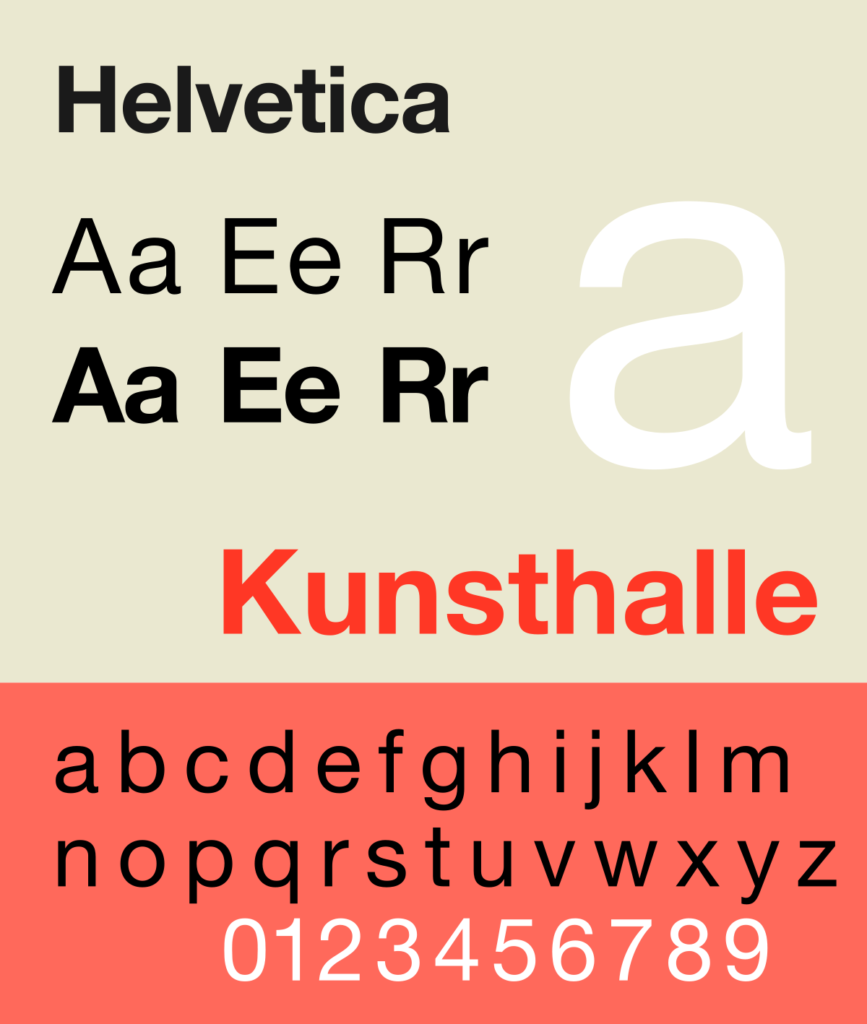
Even though this font is often ignored, many people love this until there is an excellent fanbase for Helvetica font. By the way, this font belongs to the sans-serifs fonts family, and as you can see, this font is quite symmetrical in proportion.
However, unlike other sans-serif fonts, this one also appears bigger than the others. Because of that, Helvetica belongs to the best fonts for designing an exciting PowerPoint presentation if you use it as a header or title.
2. Garamond
The second ‘font’ that you might have overlooked is Garamond. Garamond is originated in the 1500s when Claude Garamond designed this style, thus the name. From that, you may realize that Garamond is one of the oldest fonts on the planet.
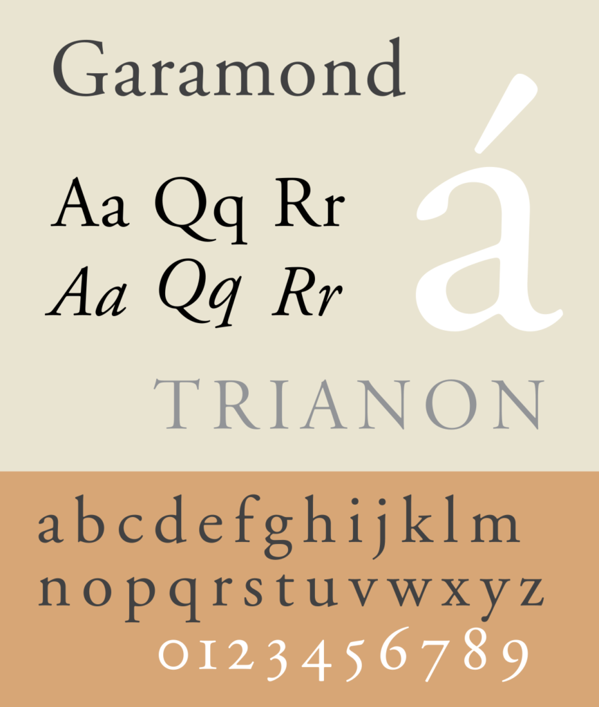
Anyway, even though this one is more like a group of fonts like sans-serifs, but this one has its particular style. The font looks like scribes’ handwriting but far more straightforward than other Roman styles to increase its legibility in printing. This font is suitable for longer text, thanks to its readability too.
3. Impact
This font is called the core font for the web. This industrial-themed font is known for its simplicity yet ‘impactful’ appearance. Because this font is the core font of the web, it has been distributed with Microsoft Windows since that good old Windows 98 release.
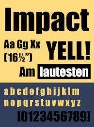
Do you know the font used for those memes on the internet? Yes, that font is Impact, just for a meme for its name. However, using this font in your presentation will not make your presentation look like a joke. Instead, this font can bring out the gravity in your presentation. This font is good for the main title of your presentation, secondary title, or any headline in it.
Must Read = HOW TO RESOLVE AT&T EMAIL NOT WORKING
4. Georgia
Widely known as an elegant font, Georgia impresses with its combination of thin and thick strokes. Many people compare this font with our most beloved Times New Roman, even though it is far simpler than its Roman counterpart.
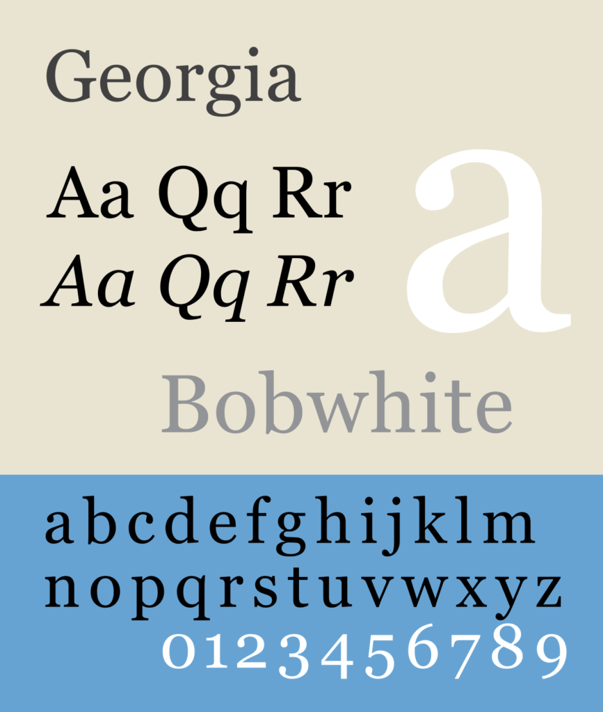
Its lowercase letters look tall compared to other fonts, making the typeface appear classic in uppercase or lowercase. This font is a safe one, meaning that you can always use it whenever and wherever, and you will still appear professional yet fun to your audiences.
5. Montserrat
This font has two versions, the thick version, and its thinner counterpart. Both of them are highly favorable by designers all around the world because of their clarity. In short, this font belongs to the best fonts for designing an exciting PowerPoint presentation because designers can always rely on it.
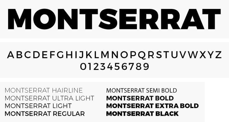
This font is versatile and looks like a whole new kind of typeface just by switching between those two versions. That’s why, when you use this font and want some variations, you may just switch between those versions.
Montserrat font is perfect for professional PowerPoint presentations, business plans, or marketing presentations.
6. KoHo
If you are a playful soul who wants an artistic font embedded in your PowerPoint presentation, you might want to consider the KoHo font. Combined with pastel colors, this font will bring your presentation an artistic golden-hour look.
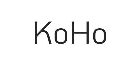
Geometric and humanist sans-serifs inspire this font. It is not only playful, but it also looks futuristic that you can use for both professional or casual presentations without worrying about being off, primarily if you use it for your kids’ school presentation.
7. League Spartan
If you remember the movie “300”, you will remember how bold those men are. Maybe that’s the inspiration for the boldness of this font. League Spartan is a heavy font that’s bolder than other bold fonts, even when the bold setting is turned off.
However, even though this font is very bold, it still has the clarity needed to make it aesthetic in your PowerPoint presentation design. What’s good about this font is, you can change its color according to the slide design, and it will appear to blend with the background.
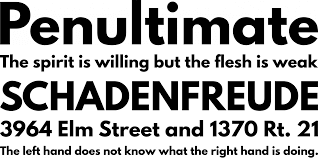
This font is perfect for bigger roles like title slide, main heading, infographics, etc. Because of its simplicity and clarity, it would make things easier to understand for your audience.
8. Playfair Display
Suppose you are looking for a more fashionable side of a serif font for your PowerPoint presentation. In that case, Playfair Display is on top among the best fonts for designing an exciting PowerPoint presentation. How can you not love the design of this font?
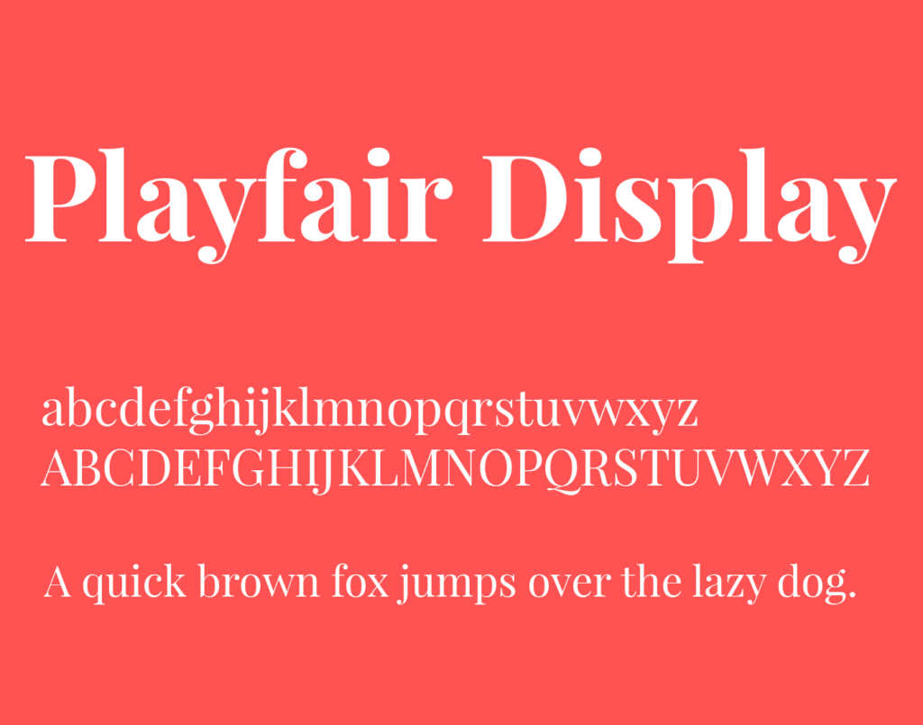
We can say that this one is the tidier version of Times New Roman, but it has a bit fashionist touch. It looks casual yet classy, and it looks professional yet youthful. Maybe because many fashion blogs and magazines are using it?
This font excels at making your headers look classy and elegant, just like the title of ‘that’ fashion magazine you usually pass through during your walk to the parking lot.
Must Read – How To Select Best Search Engine Optimization Company
9. Futura
Designed to fit into sci-fi movies to depict human civilization in the future, Futura font represents efficiency and simplicity. However, its futuristic appearance is somehow familiar with our retro times, so we can call it a retro-futuristic font.
This font has been so popular since its creation in 1927, and its versatility in both the header and body text is the key to its popularity. Advertisements and editorial designs have been in love with this font, which makes this font the chosen one to land on the moon.
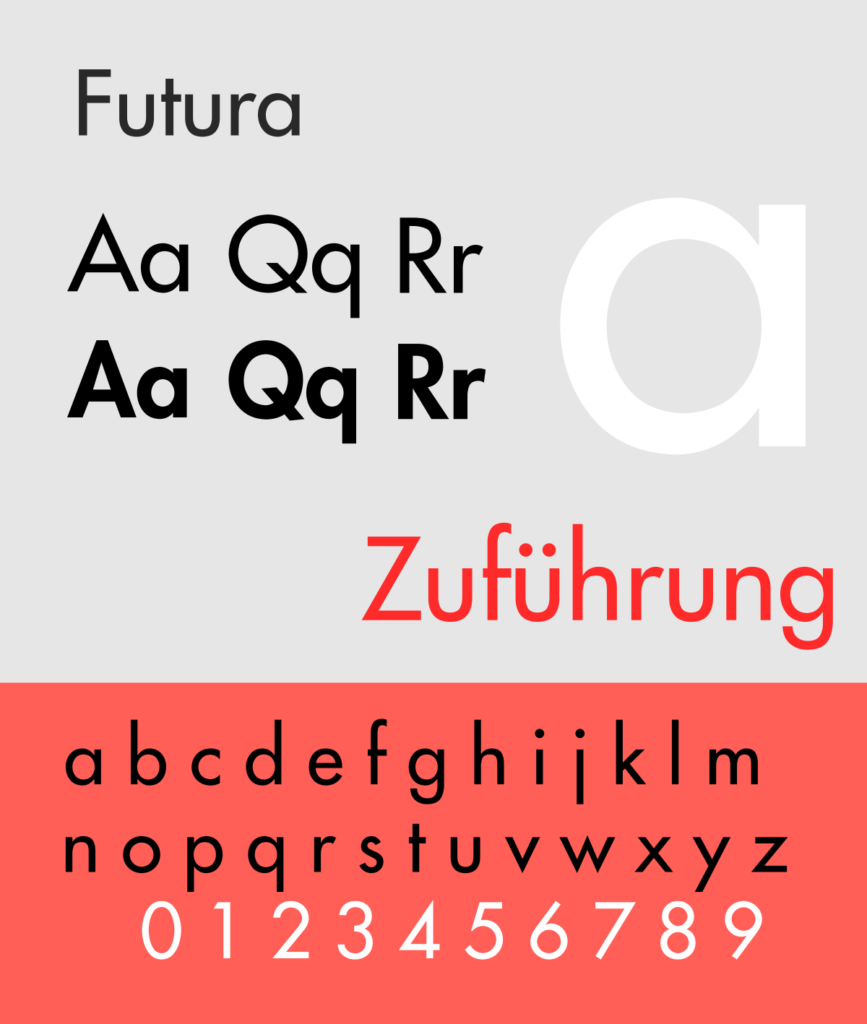
Well, albeit the background of this font, the appearance is indeed lovely. The font is elegant but has high clarity for the readers. Thus, if you want to put a text that you need your audience to read the full making content of, this font is a good choice.
10. Tahoma
If there is one font specially made to address the difficulty of reading small-sized words on an on-screen display, the font is called Tahoma. This font is unlike any other font because instead of being a master of one thing, Tahoma can be said as the “jack of all trade.”
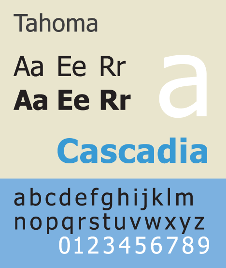
This one is one of the best fonts for designing an exciting PowerPoint presentation you need to use often if you are presenting in front of older people or people with problems reading smaller words or words written in the distance.
What makes Tahoma unique is the characters are standing closer next to each other, so we can save space in using it. This font can be combined with any different fonts and can be used as paragraphs or headers.
Choosing the right font
As we mentioned above, choosing the right font to fill in the right place is a critical part of the puzzle. That’s why, to help you determine the right font to use in your PowerPoint presentation, we give you the information that you need.
All those ten fonts explained above are the best fonts for designing an exciting PowerPoint presentation. Most designers use those fonts mentioned above, even though sometimes they combine it with another font to make the design more appealing.
But how is it to choose the right font to use in our presentation? The answer is to understand to whom we will present the PowerPoint presentation—after learning about our audience, choosing the right font would be easier because the design of those fonts is usually straightforward.


